How important is negative space important in design work?
Negative space is empty space within a design layout or image such as a poster, article, flyer, brochure or photograph. As designers, we love negative space and here’s why
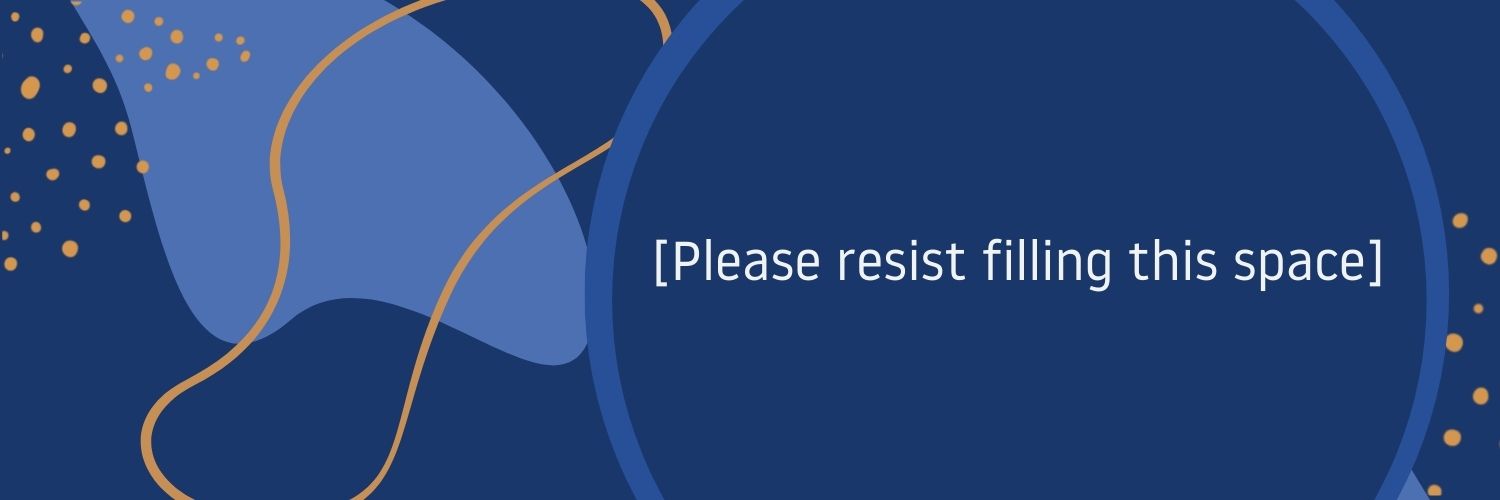
People often think that they need to cover every little section of their design with something.
But a secret weapon for graphic designers is actually to leave some space open. This creates what we call negative space. This space acts as a guide for drawing the viewers eye around the page.
If every little piece of space is filled, then any type of design can seem too busy and mean there’s too much going on.
By utilising negative space, you can make a design look clean and fresh and more appealing to your audience.
Examples of when negative space is used
Often, negative space is used in publishing to draw the viewer’s eye around an article. Designers and editors work together to indicate to the reader where they should read next.
It is also really good for marketing through branding and logo design. Have you ever noticed the bear in the Toblerone logo?
This is a crafty little trick to have hidden motifs in plain sight is used to build the positive space (filled space) in such as way that it can leave the negative space with motif.
Negative space is also used a lot in photography. So instead of filling up the whole of your image, you leave space around your subject so the viewer knows where to focus their attention.
For instance, a photo of a tree looks more interesting when it’s to the left or the right rather than central to the image. This is because the space actually draws the attention of the viewer to the tree rather than it being too dominant in the image.
How to create negative space
It may be quite hard to find room for the negative space because there is just so much information that needs to be on the page. But that’s where you need to pare back the design and think about what is really necessary to the audience.
Do they really need to know something that is just common sense? Do they need to see a certain image you had your heart set on? If the answer is no, then chop it out and create some space for the flow of the page.
Take this piece that talks about social distancing using negative space to create an atmosphere around the article. This unique way of using space to create the illusion of isolation is a perfect example of how leaving space free in design can create new meaning and intrigue for audiences.

Learning how to create negative space in design is a brilliant way to give your designs a fresh and clean look especially when it comes to branding and marketing.
For every design you create, look back at it and think “can I use negative space here to my advantage?”
Negative space is such an easy way to make any design look more appealing.