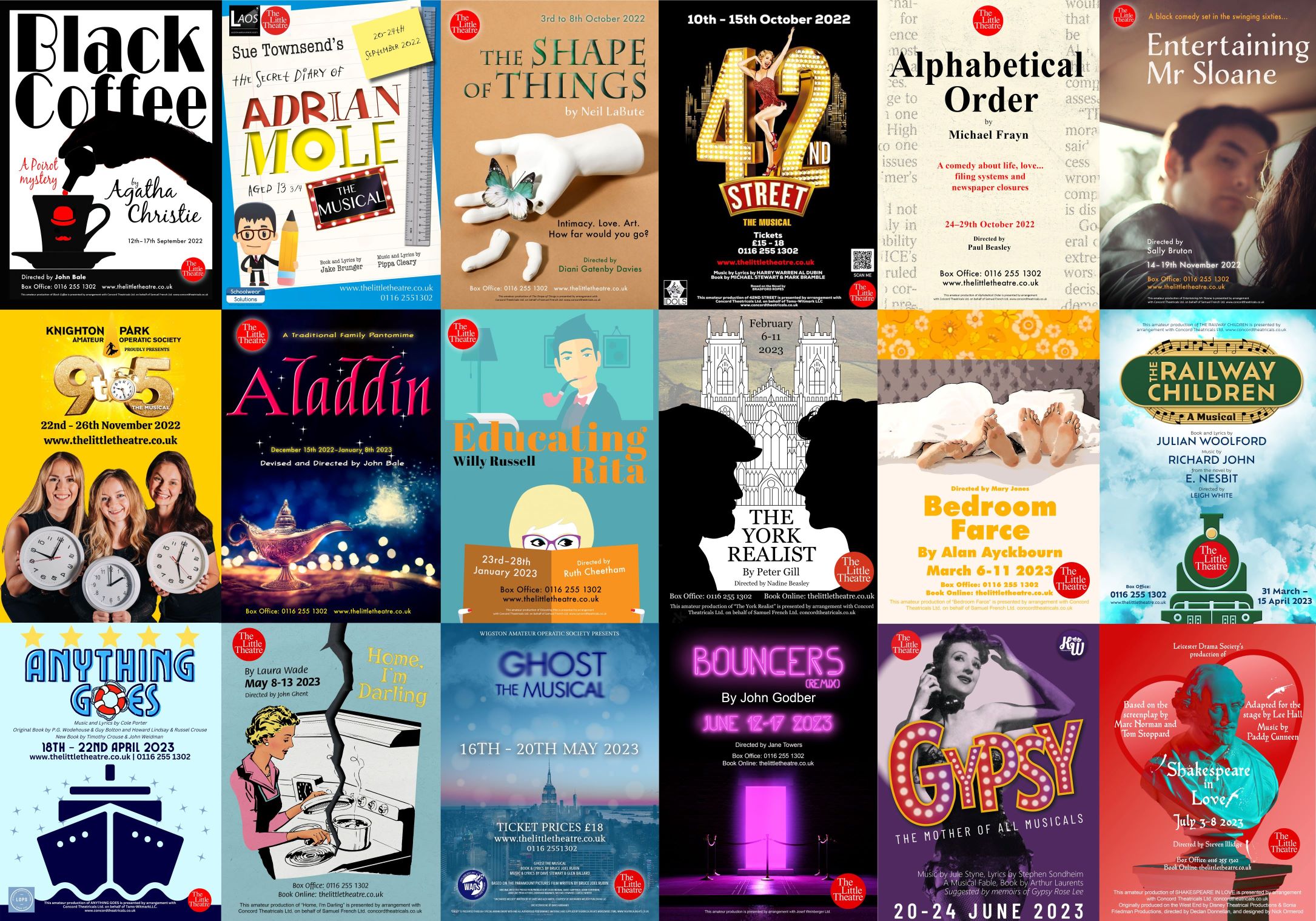
7 steps to create the perfect poster for your business, event, or performance
In today’s fast-paced digital world, knowing how to create the perfect poster should not be underestimated.
Whether you’re promoting a business, event, or performance, a compelling poster can grab attention, communicate your message effectively, and leave a lasting impression.
In this guide, we’ll walk you through seven essential steps to create a poster that stands out and drives results.
1. Define your objective and audience
Before you start designing, it’s crucial to understand your purpose and who you’re trying to reach. Ask yourself:
- What is the main goal of this poster? Is it to drive sales, create awareness, or inform about an event?
- Who is your target audience? Consider demographics, interests, and preferences.
For instance, if you want to create the perfect poster to promote a rock concert, it will have a different look and feel compared to one advertising a yoga class.
2. Craft a compelling headline and tagline
Your headline should be attention-grabbing and easy to read. It should convey the essence of your message in a concise manner. Incorporate these elements:
- Clarity: Ensure your headline is clear and easy to understand at a glance.
- Creativity: Infuse creativity to make your poster memorable.
- Relevance: Your headline should directly relate to your objective and resonate with your audience.
For example, if you’re promoting a summer sale, your headline could be “Sizzling Summer Savings – Up to 50% Off!”
3. Choose the right visuals
The imagery on your poster is often the first thing people notice. Here’s how to make sure it hits the mark:
- High-quality images: Use high-resolution images to ensure clarity and sharpness, even when printed in larger sizes.
- Relevance: Select visuals that directly relate to your message. For instance, if you’re promoting a fitness class, use images of energetic, happy individuals.
- Consistency: Maintain a consistent visual style that aligns with your brand identity.
Consider using variations of your poster for different platforms. For instance, a digital ad might benefit from dynamic visuals or animations, while a billboard might need a simpler, bold image for clarity at a distance.
4. Lay out information strategically
The layout of your poster greatly influences its effectiveness. Consider these tips:
- Hierarchy: Arrange elements (headline, visuals, details) in order of importance. Ensure the most critical information stands out.
- Negative space: Don’t overcrowd the poster. Allow for ample whitespace to give it a clean and organised look.
- Readability: Choose fonts and font sizes that are easy to read from a distance. Use contrasting colours for text and background.
For digital adverts or flyers, you may want to incorporate interactive elements, like clickable buttons or forms, to enhance user engagement.
5. Incorporate branding elements
Your poster is an extension of your brand, so make sure it reflects your identity:
- Logo: Include your logo in a prominent but unobtrusive location.
- Colour scheme: Use your brand’s colour palette to maintain consistency and strengthen brand recognition.
- Typography: Use fonts that align with your brand’s style guide.
Remember, even if the poster is promoting a specific event, the overall design should still be cohesive with your brand’s image.
6. Provide clear call-to-action (CTA)
Tell your audience what you want them to do next. This could be:
- Visit a website: Include a clear and easy-to-type URL.
- Call or email: Display contact information prominently.
- RSVP or purchase tickets: Use actionable language like “Buy Now” or “RSVP Today”.
For digital adverts, ensure the CTA is clickable and leads to the intended destination.
7. Test and adapt
Before finalising your poster, gather feedback from peers, colleagues, or even potential customers. Consider factors like:
- Effectiveness: Does the poster achieve its intended goal?
- Clarity: Is the message clear and easily understood?
- Visual impact: Do the visuals grab attention?
Remember, the design process is evolutionary. Don’t be afraid to make changes based on feedback.
Conclusion
By following these seven steps, you’re well on your way to create the perfect poster to effectively promote your business, event, or performance. Remember, each element should work harmoniously to convey your message and captivate your audience.
Whether it’s a flyer, billboard, or digital ad, a well-crafted poster has the potential to leave a lasting impression and drive the results you desire. Happy designing!


